Bombusting Communications is a startup digital marketing agency specializing in SEO and digital marketing consultancy. They sought a rebranding solution, including a new logo and website design.
As a part-time Art Director, I conducted a thorough competitor analysis to identify design trends within the industry. I then focused on creating a simple, iconic logo that incorporated the company's name.
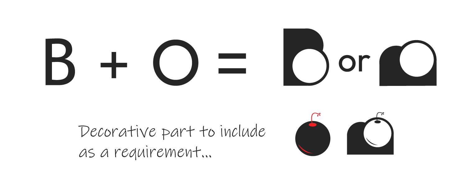
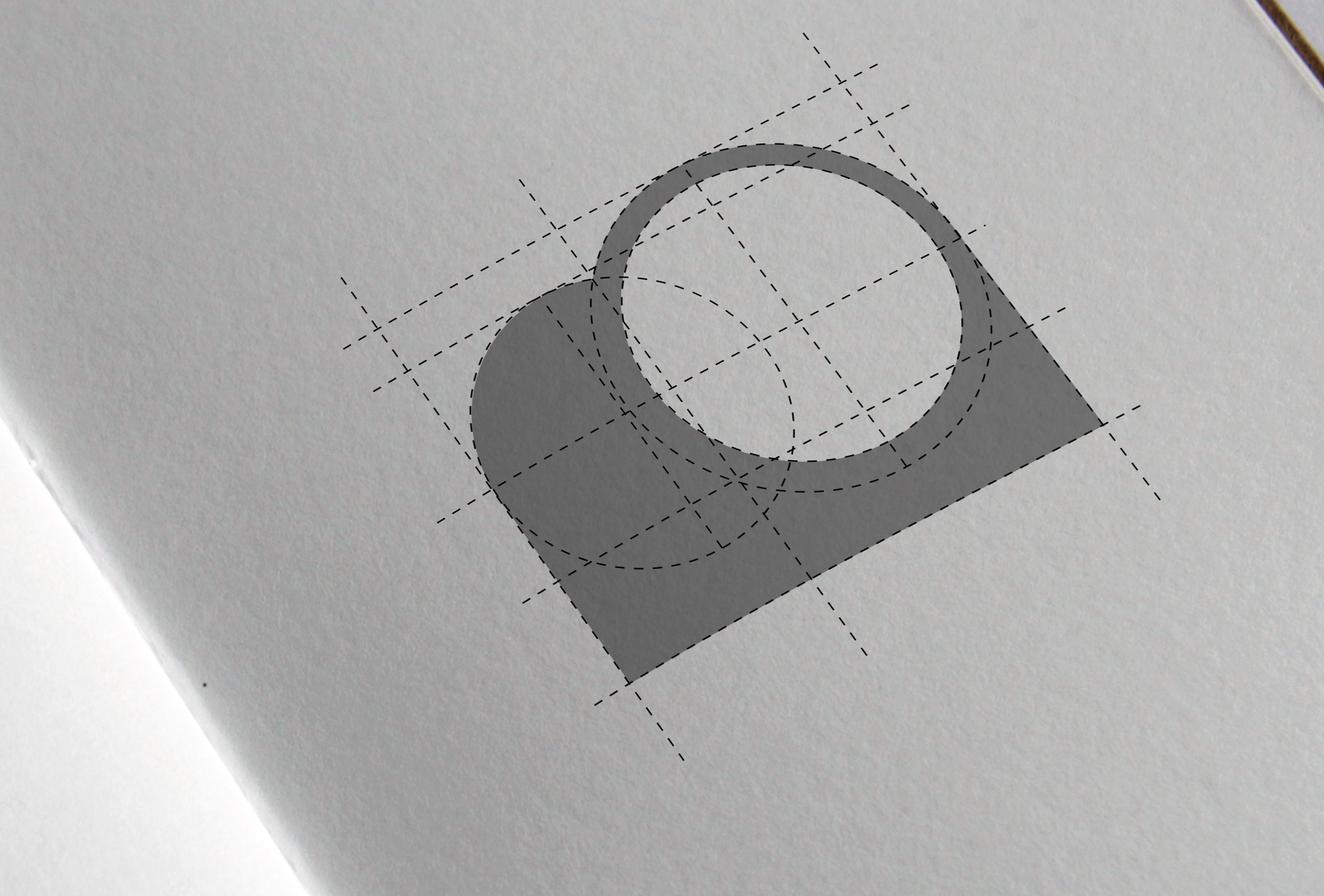
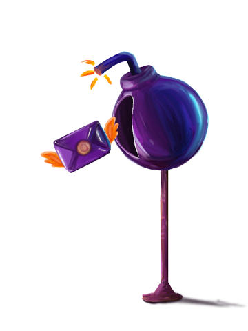
Inspired by the playful origin of the company name – a schoolyard game involving paper balls – I incorporated a subtle bomb-like element into the "O" of the logo.
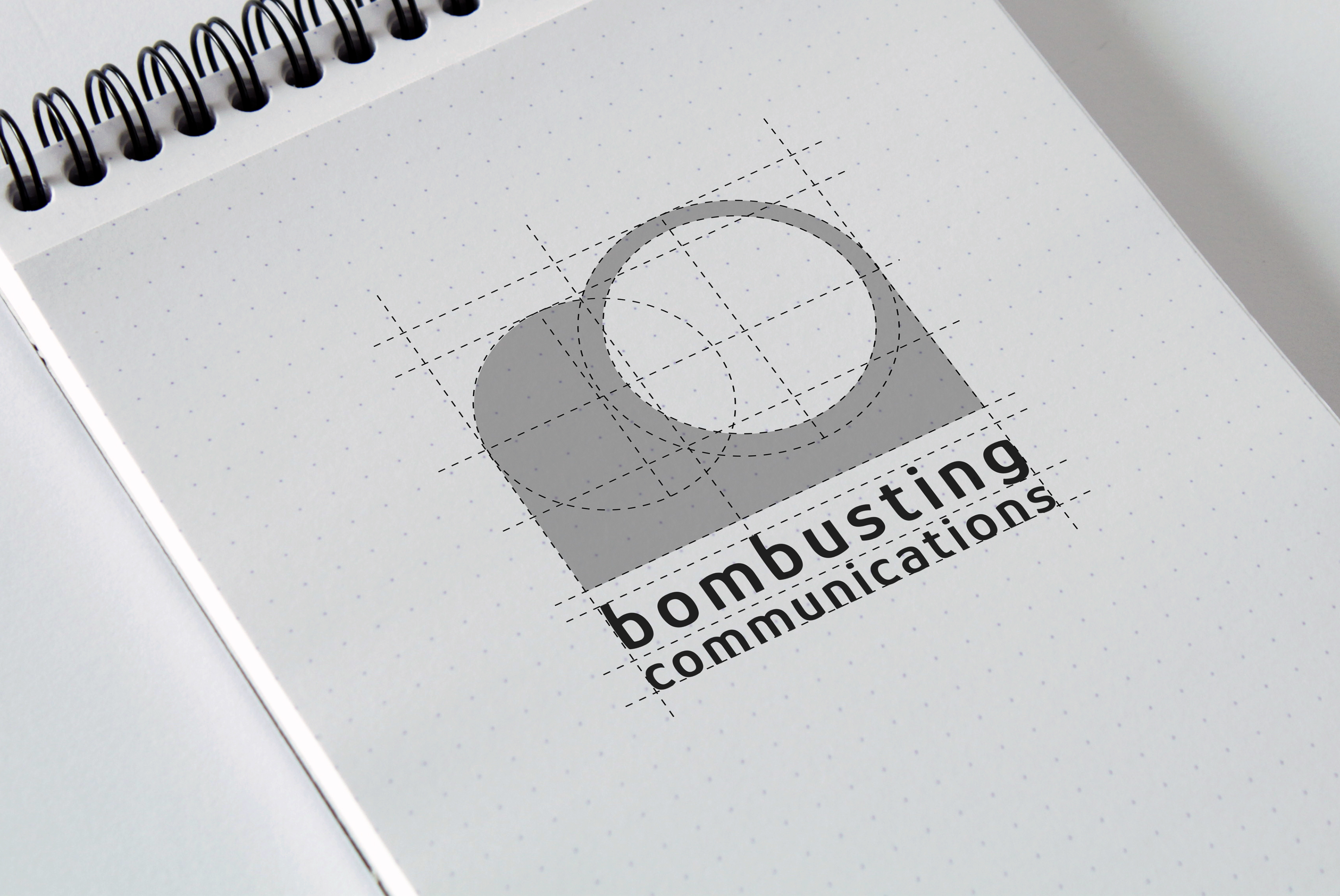
Therefore we had to select the horizontal version of the "B + O"
This design iteration was ultimately selected by the company.
Therefore we had to select the horizontal version of the "B + O"
This design iteration was ultimately selected by the company.
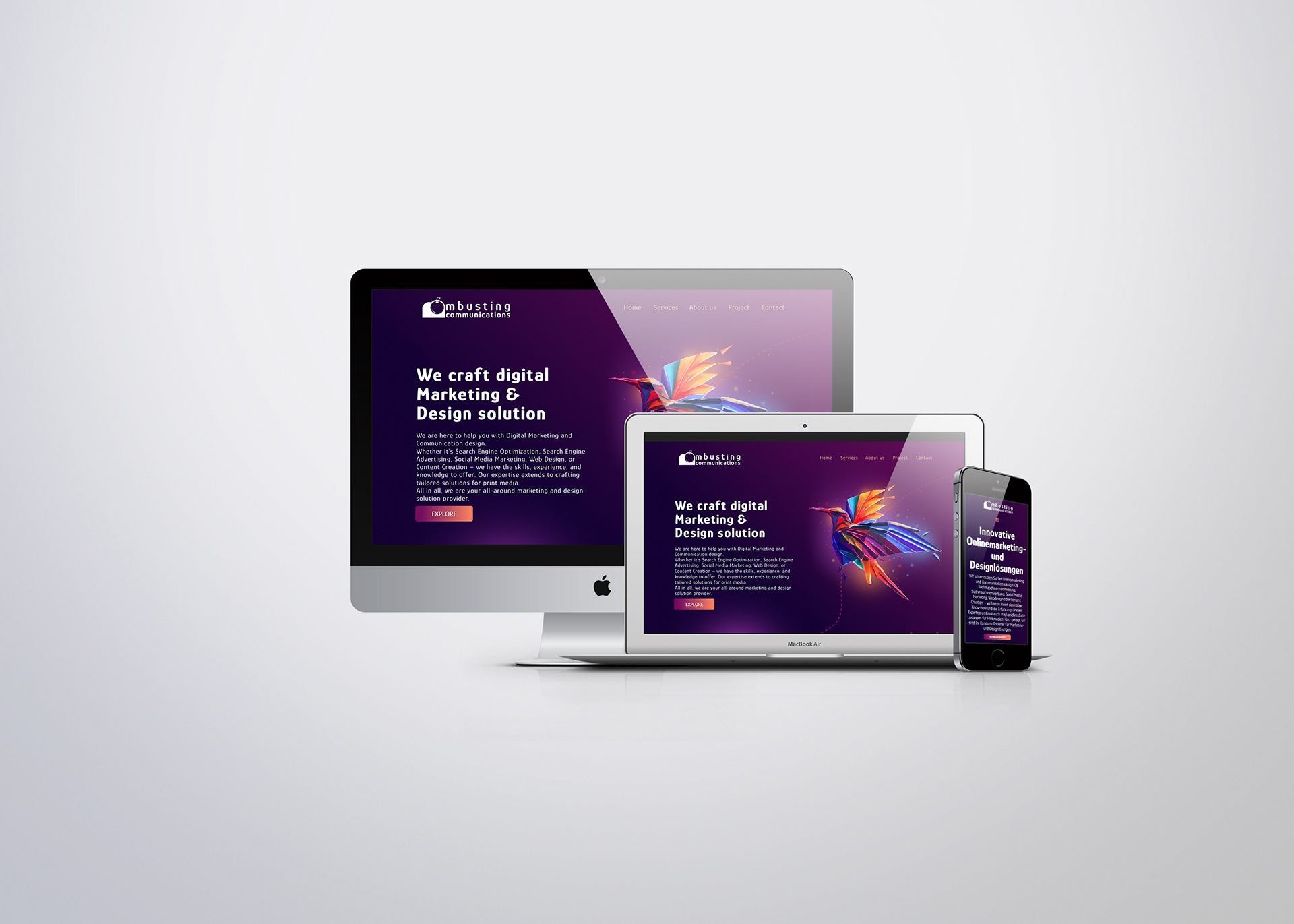
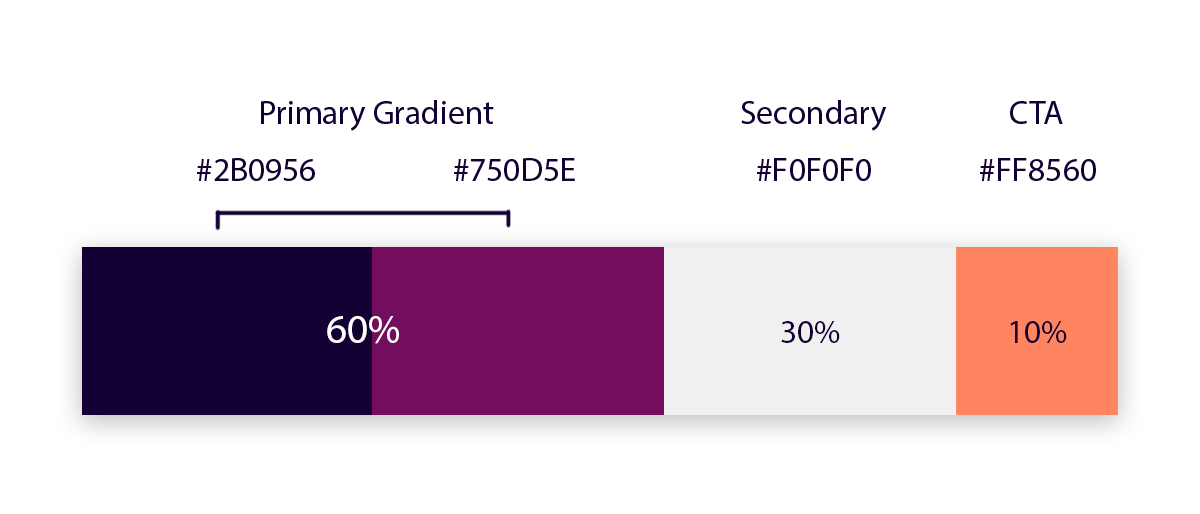
COLOR
As per the agency's request for a dark mode theme, I introduced a gradient color scheme using shades of purple and magenta as the primary colors. To ensure readability and visual comfort, I opted for a slightly off-white secondary color, avoiding pure white for better contrast. Additionally, I incorporated a contrasting matte orange color for call-to-action elements like buttons, menus, and dropdowns, enhancing their visibility and guiding user interactions.
As per the agency's request for a dark mode theme, I introduced a gradient color scheme using shades of purple and magenta as the primary colors. To ensure readability and visual comfort, I opted for a slightly off-white secondary color, avoiding pure white for better contrast. Additionally, I incorporated a contrasting matte orange color for call-to-action elements like buttons, menus, and dropdowns, enhancing their visibility and guiding user interactions.
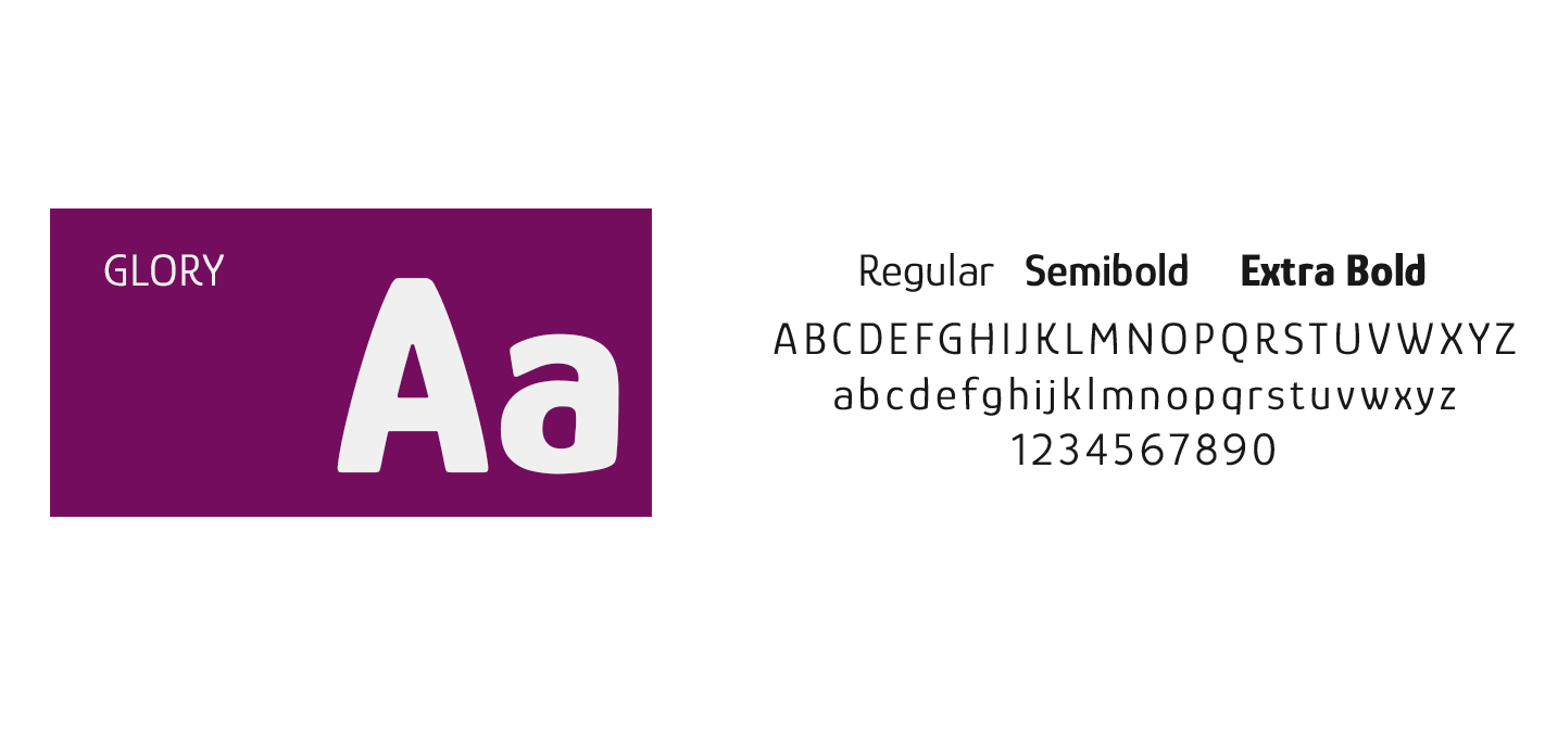
TYPOGRAPHY
I chose the "Glory" font to, for it's slight decorative appeal, as well simple and modern look.
I chose the "Glory" font to, for it's slight decorative appeal, as well simple and modern look.
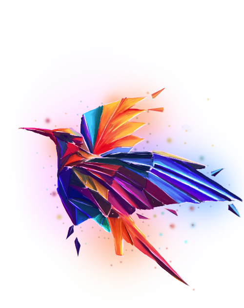
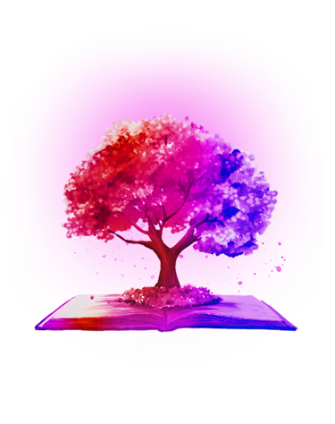
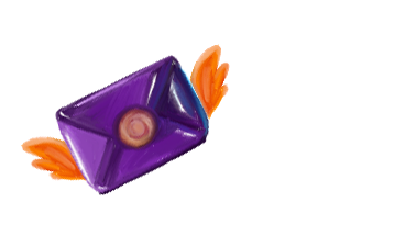
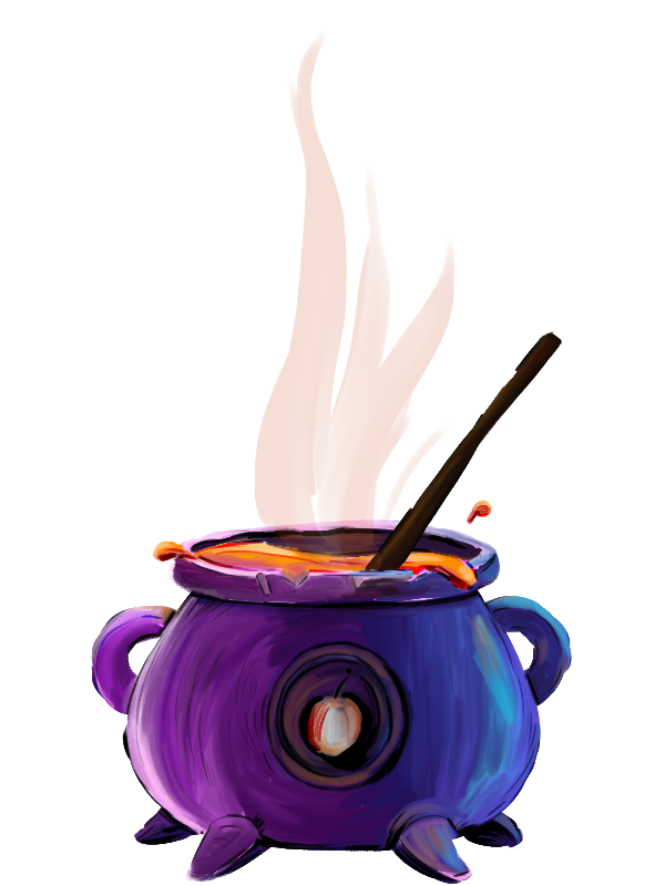
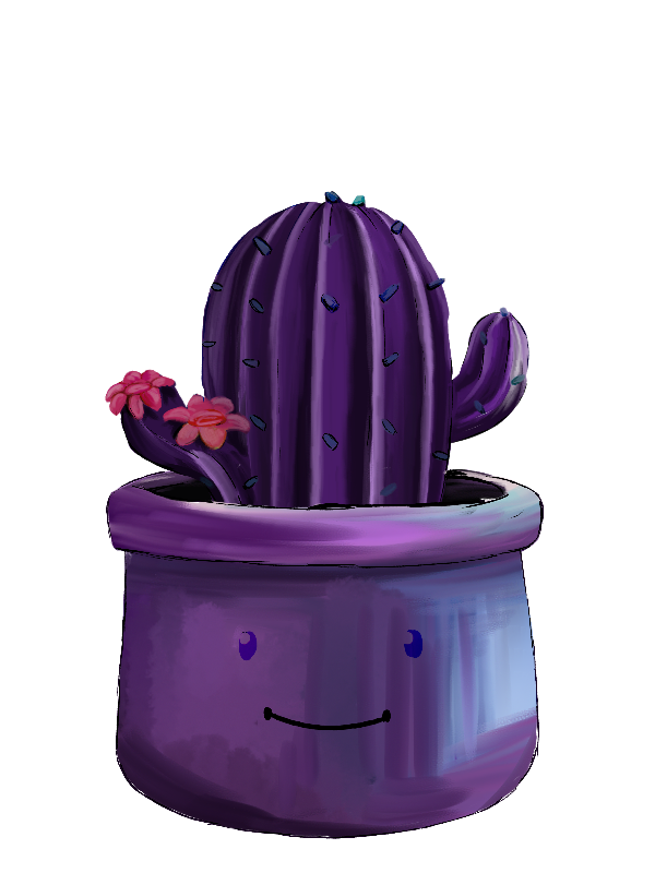
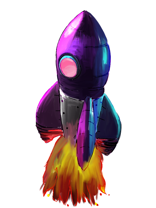
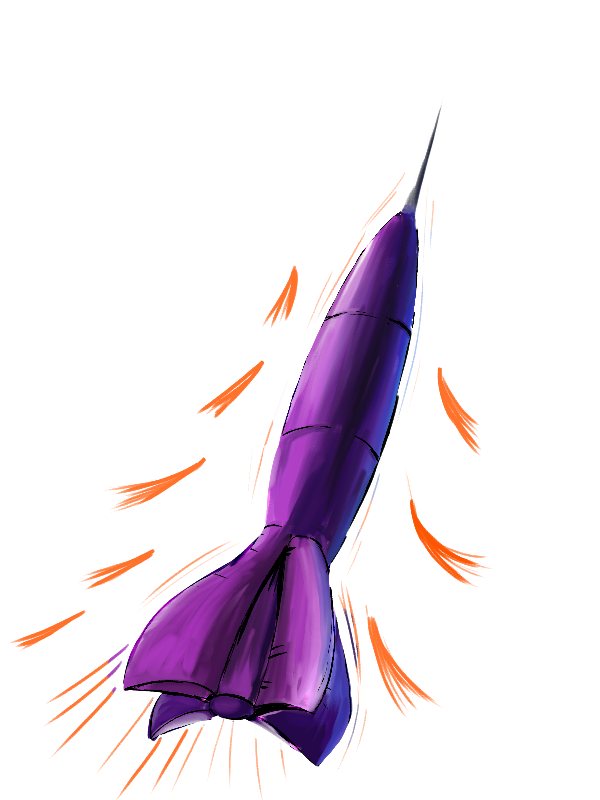
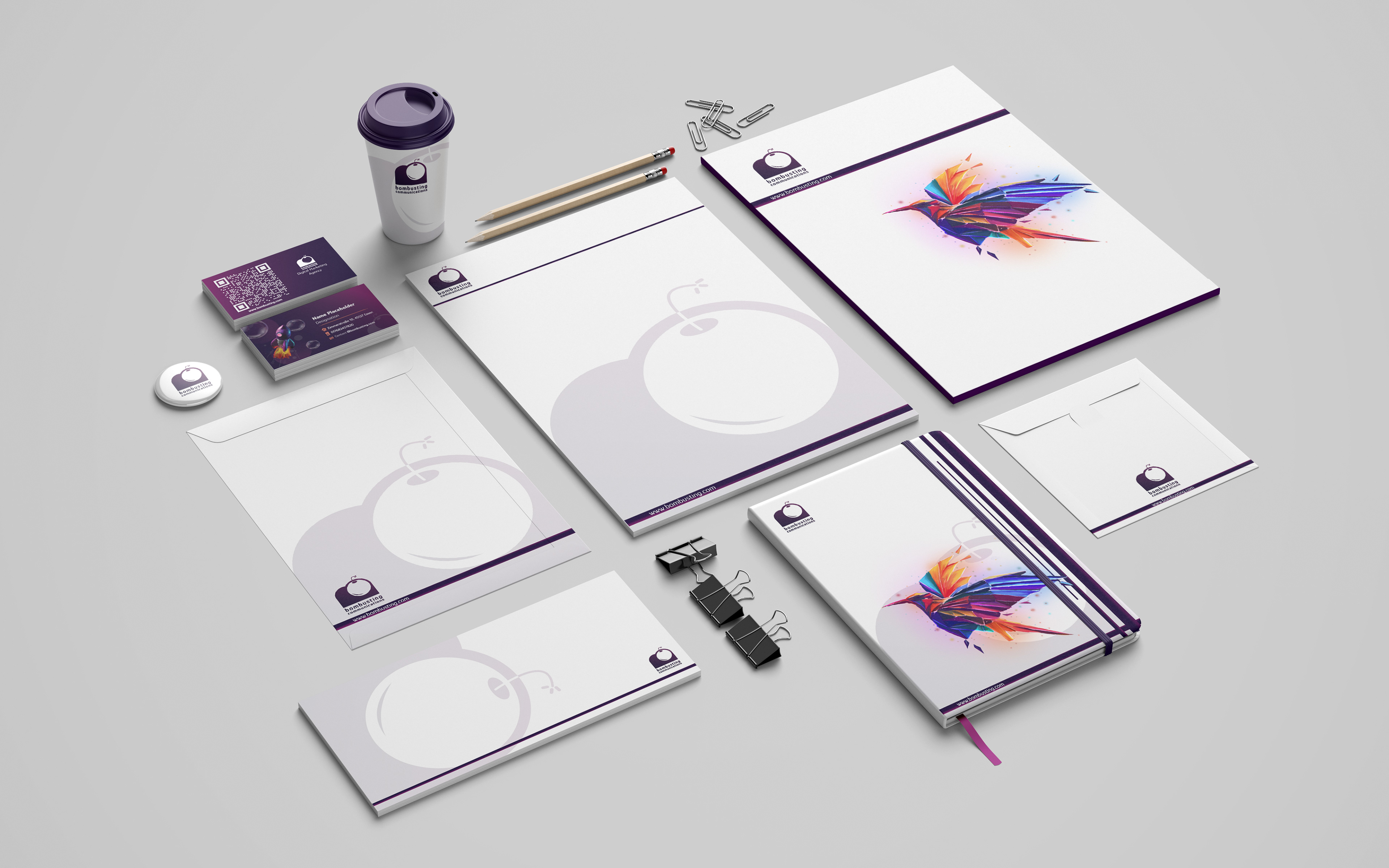
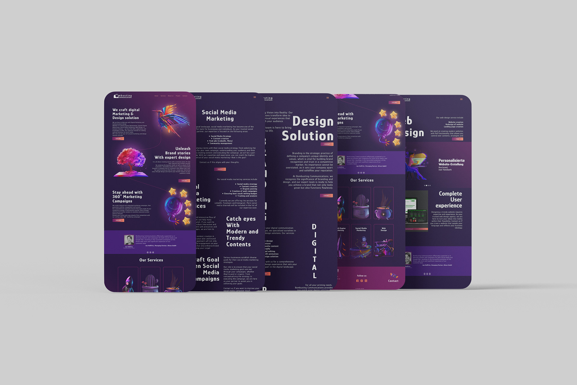
ILLUSTRATION
To get a unique identity of the brand to stand out, we decided to include custom illustrations. Here are some illustrations that I made for the websites and print materials
To get a unique identity of the brand to stand out, we decided to include custom illustrations. Here are some illustrations that I made for the websites and print materials